


[July 9, 2019]
Designing UX to Consider Cognitive Load

In User Experience, our goal is to constantly improve our customer’s interaction with our product. We iterate on our feature designs based on insights and feedback from user experience evaluations. This cyclical process brings us ever closer to a product that is intuitive, useful, and delightful for its users.
Many qualities contribute to creating a delightful product. I’ve written here about the importance of designing for trust. Something else we consider when designing user experiences is the cognitive load required to operate the product, as well as the potential for cognitive overload.
Cognitive load is the amount of mental effort required to complete a particular task. Any element of a product that we interact with, such as a button on a screen, contributes to our cognitive load. Some tasks require us to expend great mental effort, while others require very little. Factors that contribute toward cognitive load include a task’s complexity, duration, the number of elements presented, and our familiarity with the task.
There is a limit to how much cognitive load a person can reasonably take on and still be capable of performing the task at hand. Because human mental capacity is finite, our goal as designers is to minimize the extraneous cognitive load introduced by our product, to reduce any mental work on top of what’s intrinsically required to accomplish the user’s objective (in our case, exploring a building). Failure to optimize user experience leads to cognitive overload, which occurs when a person is overwhelmed to the point of inaction or misperception by the volume or complexity of the information they receive.
The following are some design practices that we apply at Shield AI to create experiences that are intuitive and effective, and that minimize cognitive load for our users:
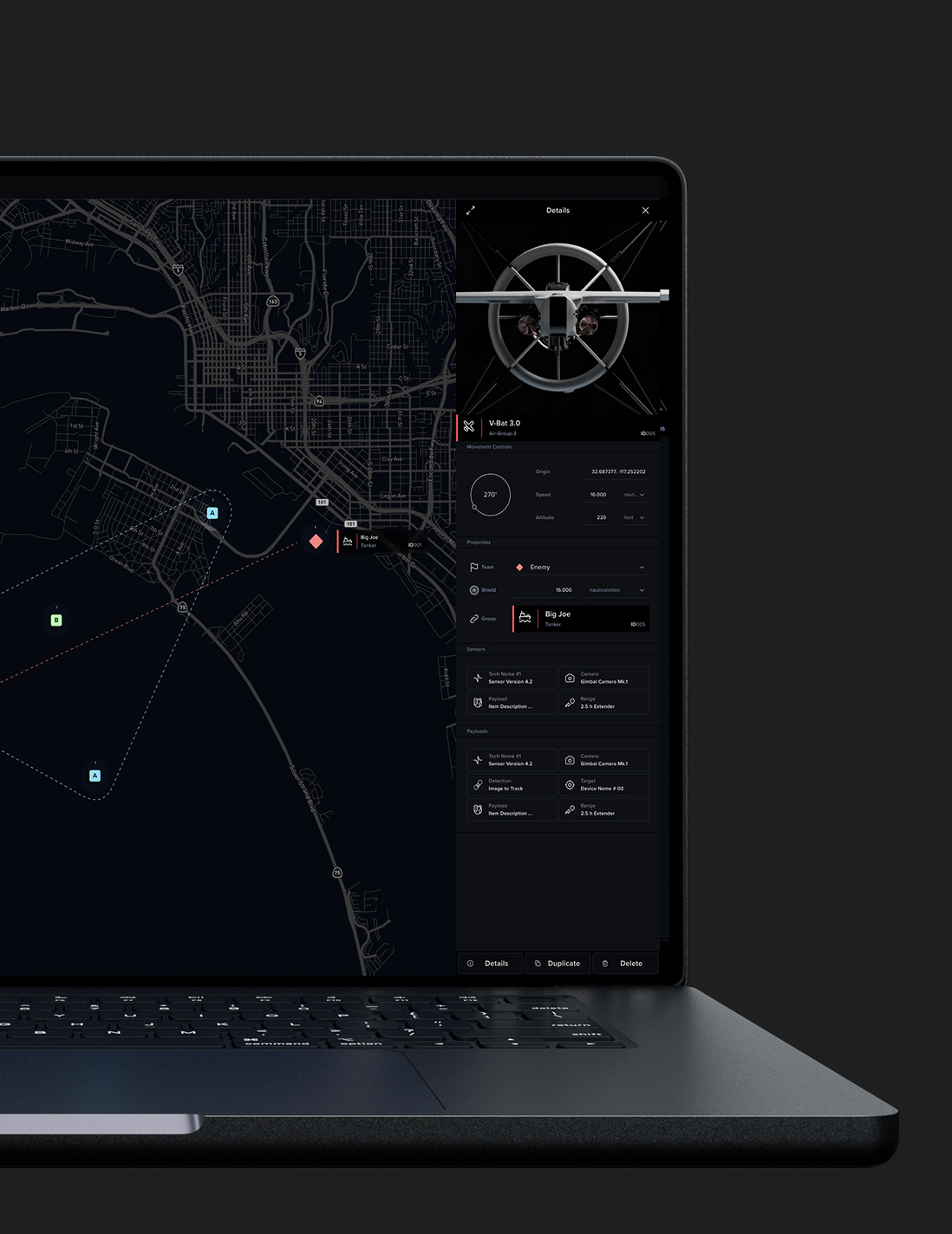
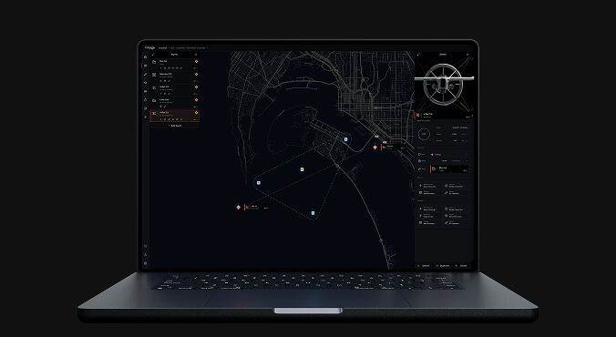
- Reduce visual clutter. Our team aims to be frugal and thoughtful about introducing new buttons, text, and colors to the user’s interface. We continually ask questions, such as, “What information does the user really need during a live flight?” “Can these elements be tucked away in a secondary view or saved for post-mission access instead?” and “Can we enable the user to customize their own view to include only what they need?”
- Group related content. Grouping together or “chunking” similar information or visual elements makes content easier to locate and to access when needed.
- Follow design conventions. Cognitive load is reduced if the user has seen something elsewhere. For example, it is now commonly accepted that an ‘X’ closes a view and a ‘<’ takes you back to a previous view. To depart from this convention would require extra learning from our users. We would require strong justification to break from such well-established mental models. From a design perspective, this can sometimes be challenging, because it requires us to exercise restraint in creating novel interactions and visual designs.
- Automate where possible. If our system can reduce the number of steps required to achieve an end goal, it frees the user to focus on more important information. For instance, Nova’s autonomous navigation allows our customers to focus on team communication and making observations, rather than having to manually pilot the robot.
Once we have arrived at a design, we test it to determine if our design choices are serving their intended purposes. This is an important step in allowing us to iterate the product to better fit the needs of our customers. The following are some of the ways we test our user experience:
- Observe behavior. With test users, present them with a task and observe where they have difficulty finding something, interact with the product unexpectedly, or vocalize their cognitive load with questions, expressions of frustrations, or signs of nervousness such as laughter. If you notice any repetitive actions, see whether you can automate those in your next product iteration.
- Timed tests. Use a timer to measure how long it takes a user to figure something out and how long the product takes to respond to user input. Even a few seconds’ delay is enough to create an unpleasant user experience and diminish a user’s sense of control. After iterating, time the procedure again to assess the improvement.
- Run an A/B test. Have users try two versions of a design and see which is more intuitive, is faster, and generates more positive feedback.
In summary, a combination of conscientious decision-making and rapid, iterative testing can serve to minimize cognitive load for the end user. In use cases where the stakes are high and every second matters, tools that prioritize efficiency and mental capacity are critical. At Shield AI we pursue this approach, among others, as we work to create the best product possible for our customers.